Have you ever visited a website that didn’t look quite right on your mobile device? It can be frustrating to have to zoom in and out or to navigate through a cluttered layout. This is where adaptive design comes in. In this article, we will explore the role of adaptive design in website development and how it can improve the user experience across different devices. With adaptive design, websites can dynamically adjust their layout and content based on the device being used, ensuring that every visitor has an optimal browsing experience. So, let’s dive in and discover how adaptive design can make a difference in the ever-evolving world of web development.
What is Adaptive Design?
Definition and concept
Adaptive design refers to a design approach that aims to create an optimal user experience across various devices and screen sizes. It involves designing websites and applications in a way that allows them to adapt and adjust their layout and content presentation according to each user’s device capabilities and preferences. Rather than having a one-size-fits-all approach, adaptive design takes into account the unique characteristics of different devices to deliver a tailored experience to each user.
Difference between adaptive design and responsive design
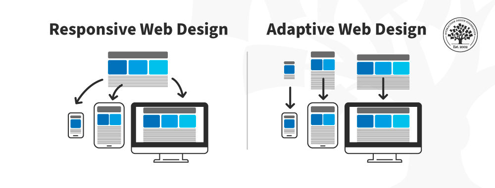
While adaptive design and responsive design both focus on optimizing the user experience across different devices, they employ different techniques to achieve this goal. Responsive design uses a flexible grid system and fluid layouts to adapt the content to different screen sizes, whereas adaptive design uses predefined layouts or templates that are specifically designed for various device categories.
The main distinction between adaptive design and responsive design lies in the approach to layout adaptation. Adaptive design uses server-side detection to identify the type of device accessing the website and then serves the appropriate layout, whereas responsive design relies on client-side techniques to dynamically adjust the layout based on the device screen size.
Benefits of Adaptive Design
Improved user experience
One of the key benefits of adaptive design is the improved user experience it offers. By providing tailored layouts and content presentation for different devices, adaptive design ensures that users can easily navigate and interact with websites and applications, regardless of their chosen device. This personalized approach leads to a more intuitive and enjoyable user experience, ultimately increasing user satisfaction and engagement.
Increased accessibility
Adaptive design also plays a crucial role in increasing accessibility for users with disabilities or impairments. By adapting the design to suit the capabilities of different devices and assistive technologies, websites and applications developed with adaptive design principles can accommodate a wider range of users. This inclusivity is essential in ensuring that everyone can access and interact with online content, regardless of their abilities.
Cross-device compatibility
With the proliferation of a variety of devices, from desktop computers to smartphones and tablets, ensuring cross-device compatibility has become increasingly important. Adaptive design allows websites and applications to seamlessly adapt to different devices, providing consistent functionality and aesthetic appeal across the board. This flexibility enables businesses and developers to reach a broader audience and ensures a consistent brand experience, regardless of the device being used.

Key Principles of Adaptive Design
Progressive enhancement
Progressive enhancement is a fundamental principle of adaptive design that involves starting with a solid foundation of core functionality and content that can be accessed by all devices. As the capabilities of a user’s device increase, additional enhancements and features are applied to enhance the user experience further. This approach ensures that the basic functionality is available to all users, regardless of device limitations, while providing extra enhancements to those with more advanced devices.
Device detection
Device detection is a key aspect of adaptive design that allows websites and applications to identify the type of device accessing the content. By detecting the device’s capabilities, such as screen size, operating system, or input methods, developers can serve the appropriate layout and content for optimal user experience. Device detection can be performed on the server side or client side, depending on the implementation.
Flexible layouts
Flexible layouts are another essential principle of adaptive design. By creating layouts that can adapt and adjust based on the available screen space, developers can ensure that the content remains legible and well-organized across different devices. This involves using relative units, such as percentages or ems, instead of fixed pixel values for defining layout properties. Flexible layouts allow content to be resized and repositioned dynamically, ensuring a seamless user experience across various devices.
Adaptive Design Techniques
Flexible media queries
Media queries play a crucial role in adaptive design by allowing developers to apply different styles and layout rules based on the characteristics of the device. Flexible media queries enable websites and applications to respond to changes in screen size, orientation, or other device capabilities. By defining breakpoints in the CSS code, developers can control the layout and presentation of content at specific screen sizes, ensuring a smooth transition between different device categories.
Viewport-based layouts
Viewport-based layouts are an effective technique used in adaptive design to adapt the layout based on the viewport size of the device. The viewport refers to the visible area of the device screen, and viewport-based layouts allow developers to dynamically adjust the content and layout to fit within this visible area. This technique ensures that users can view and interact with the content without the need for excessive scrolling or zooming, providing an optimal user experience.
Conditional loading of resources
Considering the varying capabilities and bandwidth limitations of different devices, adaptive design often involves the conditional loading of resources. This means that resources, such as images or scripts, are only loaded when they are necessary or when the device supports them. This approach helps to optimize page load times and reduce data consumption, resulting in a faster and more efficient browsing experience for users.

Considerations for Implementing Adaptive Design
Identifying target devices
When implementing adaptive design, it is essential to identify the target devices that your website or application will be accessed on. This involves researching and understanding the characteristics and capabilities of the devices your target audience is likely to use. By gaining insights into the device landscape, you can tailor your adaptive design approach to meet the specific needs and preferences of your users.
Content prioritization
Adaptive design requires careful consideration of content prioritization. With limited screen space on smaller devices, it is crucial to prioritize the most important content and features, ensuring that they are easily accessible to users. By structuring and organizing content based on its importance and relevance, you can provide a seamless browsing experience, even on smaller devices.
Performance optimization
Performance optimization is a vital consideration when implementing adaptive design. On devices with limited resources or slower internet connections, it is crucial to minimize page load times and reduce the overall resource consumption. Techniques such as image optimization, code minification, and caching can help improve performance and ensure a smooth browsing experience for all users.
Case Studies on Successful Implementation
Major brands using adaptive design
Numerous major brands have successfully implemented adaptive design to enhance their online presence. One notable example is Airbnb, a popular online marketplace for short-term rentals. By employing adaptive design, Airbnb ensures that its website delivers a consistent and optimized user experience across a wide range of devices, from desktop computers to smartphones and tablets. This approach has contributed to Airbnb’s global success and popularity among travelers.
Another major brand that utilizes adaptive design is Google. With its diverse range of products and services, Google consistently strives to provide a seamless user experience across different devices. Through adaptive design, Google ensures that users can easily access and navigate their various services, such as Gmail, Google Maps, and Google Drive, regardless of the device they are using.
Positive impact on user engagement and conversions
Implementing adaptive design has been shown to have a positive impact on user engagement and conversions. By providing users with a tailored and intuitive experience, adaptive design encourages longer site visits, increased interaction, and higher conversion rates. Studies have shown that websites and applications that leverage adaptive design principles experience improved user engagement metrics, such as lower bounce rates, longer session durations, and higher conversion rates.
Challenges and Limitations of Adaptive Design
Increased development time
One of the challenges of implementing adaptive design is the increased development time required. Compared to creating a single responsive design that adapts to different screen sizes, developing multiple layouts for different device categories can be more time-consuming. Each layout must be carefully designed and tested to ensure optimal user experience, resulting in a longer development process.
Maintenance complexity
Maintaining an adaptive design can be more complex compared to a single responsive design. With multiple layouts and templates, any updates or changes to the design or functionality may require modifications across various versions of the website or application. This complexity can make maintenance more time-consuming and challenging, especially as new devices and screen sizes continue to emerge.
Compatibility issues with older devices
Adaptive design may face compatibility issues with older devices that may not support the advanced capabilities required for specific layouts or features. These devices may have limitations in terms of browser rendering, screen resolution, or processing power, which can impact the user experience. It is essential to consider the device landscape and strike a balance between providing a seamless experience for modern devices while still ensuring satisfactory usability for older devices.
Emerging Trends in Adaptive Design
Adaptive design for wearables and IoT devices
As wearable technology and Internet of Things (IoT) devices continue to gain popularity, adaptive design is evolving to cater to these emerging platforms. Designing for smaller screens, limited input methods, and unique interaction patterns present new challenges and opportunities. Adaptive design for wearables and IoT devices involves creating interfaces that seamlessly adapt to the form factor and context of these devices, providing a cohesive user experience.
Integration with machine learning and AI
Another emerging trend in adaptive design is the integration of machine learning and artificial intelligence (AI) technologies. These technologies can analyze user behavior, preferences, and contextual data to dynamically adapt the design elements and content presentation in real-time. By leveraging machine learning algorithms, adaptive design can personalize the user experience even further, delivering customized content and recommendations that align with the user’s needs and preferences.
Best Practices for Adaptive Design
User-centered design approach
Adopting a user-centered design approach is essential when implementing adaptive design. By understanding your target audience and their preferences, you can create layouts, content structures, and navigation systems that cater to their needs. Conducting user research, usability testing, and collecting feedback throughout the design process can help ensure that your adaptive design meets the expectations and requirements of your users.
Regular testing and optimization
Continuous testing and optimization are vital to maintaining and improving the performance of adaptive designs. Testing the website or application across different devices and screen sizes helps identify any layout or functionality issues that may arise. Regularly analyzing user data, such as engagement metrics and conversion rates, can provide insights into areas that require optimization. Based on these findings, necessary adjustments can be made to improve the overall user experience and drive better results.
Collaboration between designers and developers
A successful implementation of adaptive design requires close collaboration between designers and developers. Designers and developers should work together from the early stages of the project to ensure that the design concepts and technical feasibility align. By fostering effective communication and collaboration, designers can create adaptive design concepts that can be efficiently implemented, while developers can provide input on technical considerations and limitations.
Conclusion
In today’s digital landscape, adaptive design plays a crucial role in website development by ensuring an optimal user experience across different devices. By tailoring layouts and content presentation based on the unique characteristics of each device, adaptive design enhances user engagement, increases accessibility, and improves cross-device compatibility. With its key principles, techniques, case studies, and emerging trends, adaptive design offers a comprehensive approach to developing websites and applications that meet the diverse needs of modern users. By embracing adaptive design and following best practices, businesses and developers can create websites and applications that deliver outstanding user experiences and drive better results.