“Have you ever wondered about the power of interactive data visualization?”
When it comes to analyzing and interpreting data, traditional methods such as spreadsheets can sometimes fall short in terms of providing a clear and intuitive understanding of complex information. This is where interactive data visualization comes in. By creating dynamic and interactive visual representations of data, you can gain valuable insights and make informed decisions based on your findings. Let’s explore the world of interactive data visualization and how it can enhance your data analysis capabilities.

“What is Interactive Data Visualization?”
Interactive data visualization is the process of representing data visually in a dynamic and interactive way, allowing users to explore and interact with the information presented. Unlike static graphs or charts, interactive data visualization tools enable users to drill down into specific data points, filter information based on certain criteria, and gain a deeper understanding of the underlying patterns and trends within the data. This interactive approach not only makes data analysis more engaging but also facilitates easier and more effective decision-making.
“Benefits of Interactive Data Visualization”
Interactive data visualization offers several key benefits that make it a valuable tool for data analysis:
-
Enhanced Understanding: By visualizing data in an interactive format, users can gain a clearer and more intuitive understanding of the information presented. This can lead to improved insights and better decision-making.
-
Exploratory Analysis: Interactive data visualization tools enable users to explore data in a more dynamic and flexible manner. By interacting with the visual representations of data, users can uncover hidden patterns, outliers, and trends that may not be immediately apparent in static charts or tables.
-
Engagement: The interactive nature of data visualization tools makes the process of analyzing data more engaging and interactive. Users can actively participate in the analysis process, leading to a more immersive and enjoyable data exploration experience.
-
Real-Time Feedback: Interactive data visualization tools often provide real-time feedback on changes made to the data or the visualization settings. This instant feedback loop allows users to see the impact of their actions immediately, enabling faster and more iterative analysis.
“Types of Interactive Data Visualization Tools”
There is a wide range of interactive data visualization tools available, each with its own unique features and capabilities. Some of the most common types of interactive data visualization tools include:
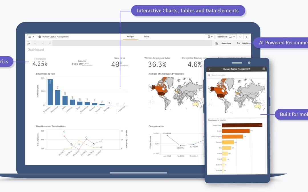
“Interactive Dashboards”
Interactive dashboards are a popular type of data visualization tool that provides a comprehensive overview of key metrics and KPIs in a single, interactive interface. Users can customize the dashboard by selecting specific data points to display, filtering information based on timeframes or other criteria, and drilling down into detailed data sets for deeper analysis.
“Data Exploration Tools”
Data exploration tools are designed to facilitate the exploration and analysis of large and complex data sets. These tools often include interactive features such as zooming, filtering, and sorting capabilities, allowing users to interact with the data in a more dynamic and intuitive way. Data exploration tools are especially useful for uncovering patterns, trends, and insights within data that may not be immediately apparent.
“Interactive Charts and Graphs”
Interactive charts and graphs are visual representations of data that allow users to interact with the information presented. Users can hover over data points to view additional details, zoom in on specific areas of the chart, or filter data based on certain criteria. Interactive charts and graphs are versatile tools that can be customized to suit different data visualization needs.

“How to Create Interactive Data Visualizations”
Creating interactive data visualizations requires a combination of data analysis skills, design expertise, and knowledge of data visualization tools. Here are some key steps to follow when creating interactive data visualizations:
“1. Define Your Objectives”
Before you start creating interactive data visualizations, it’s important to define your objectives and determine the key insights you want to gain from the data. Identify the purpose of the visualization, the target audience, and the specific metrics or KPIs you want to highlight.
“2. Choose the Right Data Visualization Tool”
Selecting the right data visualization tool is crucial for creating engaging and effective visualizations. Consider factors such as the complexity of your data, the level of interactivity you require, and the visual style that best suits your data presentation needs. Some popular data visualization tools include Tableau, Power BI, and D3.js.
“3. Clean and Prepare Your Data”
Before you can create interactive data visualizations, you need to clean and prepare your data for analysis. This may involve removing duplicates, correcting errors, or transforming data into a more structured format. Clean and well-prepared data is essential for creating accurate and insightful visualizations.
“4. Design Your Visualization”
When designing interactive data visualizations, consider the principles of good data visualization design, such as simplicity, clarity, and consistency. Choose the right type of visualization that best represents your data, and customize the design elements such as colors, fonts, and labels to enhance readability and visual appeal.
“5. Add Interactivity”
The key feature of interactive data visualizations is the ability to interact with the data. Incorporate interactive elements such as filters, tooltips, zooming capabilities, and drill-down features to enable users to explore the data in a more dynamic and engaging way. Interactive elements enhance the usability and effectiveness of your visualizations.
“6. Test and Iterate”
Once you have created your interactive data visualizations, it’s essential to test them with real users to gather feedback on usability and effectiveness. Iterate on your design based on user feedback, and make any necessary adjustments to improve the overall user experience. Testing and iteration are key steps in creating interactive visualizations that provide valuable insights.
“Best Practices for Interactive Data Visualization”
To create effective interactive data visualizations, it’s important to follow best practices that enhance the usability and impact of your visualizations. Here are some key best practices to keep in mind when creating interactive data visualizations:
“Keep it Simple”
Simplicity is key when designing interactive data visualizations. Avoid cluttering the visualizations with unnecessary elements or excessive detail. Focus on highlighting the most important data points and insights, and design the visualization in a clear and easy-to-understand format.
“Use Consistent Design Elements”
Consistency in design elements such as colors, fonts, and labels helps users navigate the visualization more effectively. Use a cohesive color palette, consistent font styles, and clear labeling to maintain visual harmony and cohesion throughout the visualization.
“Provide Context and Explanation”
Help users interpret the data by providing context and explanations within the interactive visualization. Include labels, legends, and tooltips that explain the meaning of data points, highlight trends or patterns, and guide users on how to interact with the visualization effectively. Contextual information enhances the user’s understanding of the data.
“Enable Customization and Filters”
Allow users to customize the visualization based on their preferences and filtering criteria. Provide interactive elements such as filters, sliders, and drop-down menus that enable users to focus on specific data points, drill down into details, or manipulate the visualization to suit their analysis needs. Customization options enhance the user’s engagement with the data.
“Optimize for Performance”
Ensure that your interactive data visualizations are optimized for performance to deliver a seamless user experience. Optimize loading times, minimize latency, and test the visualizations across different devices and browsers to ensure compatibility and responsiveness. Performance optimization is crucial for creating interactive visualizations that are user-friendly and efficient.

“Examples of Interactive Data Visualization in Action”
Interactive data visualization is widely used across various industries and applications to analyze and present data in an engaging and interactive format. Here are some examples of interactive data visualization in action:
“Financial Dashboards”
In the finance industry, interactive dashboards are used to track key financial metrics, monitor market trends, and analyze investment portfolios. Users can customize the dashboard by selecting specific financial indicators, comparing performance across different assets, and drilling down into detailed financial data for deeper analysis. Financial dashboards provide real-time insights and enable users to make informed decisions based on the data presented.
“Healthcare Analytics”
In the healthcare sector, interactive data visualization tools are employed to analyze patient data, monitor healthcare trends, and track disease outbreaks. Healthcare professionals can visualize patient outcomes, compare treatment options, and identify patterns in health data using interactive charts, graphs, and dashboards. Interactive data visualization in healthcare facilitates evidence-based decision-making and improves patient care outcomes.
“Marketing Campaign Analysis”
Marketers use interactive data visualization tools to analyze marketing campaign performance, track customer behavior, and optimize marketing strategies. Interactive dashboards enable marketers to visualize key marketing metrics, segment customer data, and analyze campaign ROI in real-time. By interacting with the data, marketers can identify trends, target specific customer segments, and refine marketing tactics for better results.
“Conclusion”
Interactive data visualization is a powerful tool for analyzing, interpreting, and presenting data in a dynamic and engaging way. By creating interactive visualizations that enable users to explore and interact with data, you can gain valuable insights, uncover hidden patterns, and make informed decisions based on data-driven evidence. Whether you are a data analyst, a business leader, or a researcher, interactive data visualization can enhance your data analysis capabilities and help you unlock the full potential of your data. Embrace the power of interactive data visualization and transform the way you analyze and interpret data.
