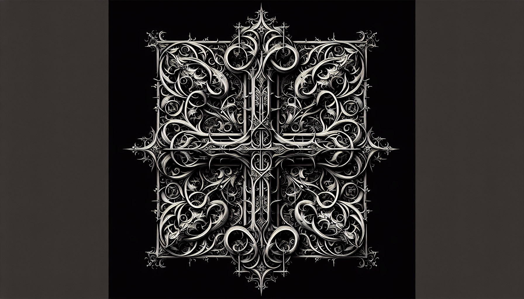
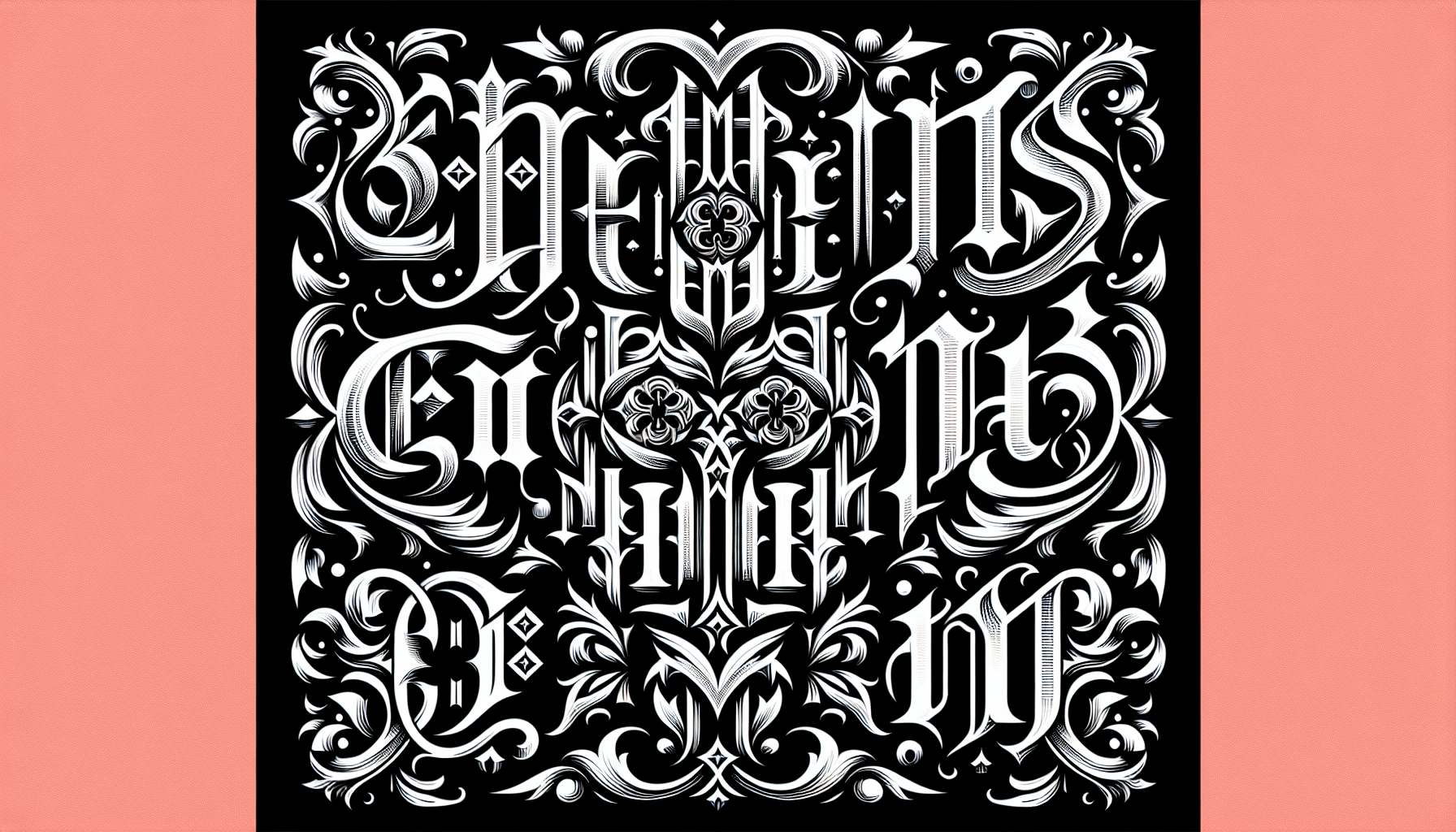
Imagine stepping into a world where elegance and history intertwine, where ink dances across the page in intricate and mesmerizing patterns. This is the enigmatic world of blackletter, a form of calligraphy known for its bold and ornate style. In this article, we will embark on a journey to explore the captivating beauty of gothic fonts and uncover the secrets behind their timeless appeal. From their origins in medieval manuscripts to their modern-day significance in branding and design, blackletter fonts continue to captivate and inspire artists, designers, and font enthusiasts alike. Get ready to unravel the mystique of blackletter and discover a whole new level of artistic expression.

1. History of Blackletter Fonts
Blackletter fonts, also known as Gothic fonts, have a rich and fascinating history that dates back centuries. These distinctive typefaces were prevalent during the medieval period in Europe and are characterized by their ornate and intricate letterforms. Understanding the origins, popularity, decline, and eventual revival of blackletter fonts provides valuable insight into the evolution of typography and its enduring appeal.
1.1 Origins of Blackletter Fonts
The origins of blackletter fonts can be traced back to the Carolingian minuscule, a script developed during the reign of Charlemagne in the 9th century. This script evolved into the early handwriting style known as Caroline script, which served as the foundation for the development of blackletter fonts. The transition from the Carolingian minuscule to blackletter fonts marked a shift towards a more angular and condensed letterform, characterized by sharp, gothic-like elements.
1.2 Popularity in Medieval Europe
Blackletter fonts reached the peak of their popularity during the medieval period in Europe, particularly in Germany, France, and England. These fonts became the principal typefaces used in the production of manuscripts, religious texts, and official documents. The blackletter style was well-suited for the intricate, handcrafted nature of illuminated manuscripts, with its ornate capital letters and elaborate flourishes enhancing the visual appeal of these texts.
1.3 Decline and Revival of Blackletter Fonts
The decline of blackletter fonts began with the advent of Roman typefaces in the 15th century, which offered a more legible and less ornate alternative. With the invention of the printing press by Johannes Gutenberg in the mid-15th century, Roman typefaces gained widespread popularity due to their ease of reproduction. Blackletter fonts fell out of favor, becoming associated with the past and the old-fashioned. However, there was a resurgence of interest in blackletter fonts during the Arts and Crafts movement in the late 19th and early 20th centuries, as artists and designers sought to revive the craftsmanship and aesthetic of medieval times.
2. Characteristics of Blackletter Fonts
Blackletter fonts encompass various sub-styles, each with its own unique characteristics and visual appeal. The three main sub-types of blackletter fonts are Fraktur, Textura, and Schwabacher, each representing a distinct approach to letterforms.
2.1 Fraktur Typeface
Fraktur is perhaps the most widely recognized and influential style of blackletter fonts. Its distinctive features include broken or angular letterforms with sharp, jagged edges. This typeface is often associated with German-speaking regions and is widely used in the printing of books, newspapers, and other printed materials.
2.2 Textura Typeface
Textura, also referred to as Gothic textura, is characterized by its dense and closely packed letterforms. The letters in this typeface appear heavily textured, as if created with a fine pen or brush. Textura fonts are primarily used in the production of religious texts, especially during the medieval period.
2.3 Schwabacher Typeface
Schwabacher is a style of blackletter font that originated in the 15th century and gained popularity in Germany. It is known for its more rounded and fluid letterforms compared to Fraktur or Textura. Schwabacher typefaces are often used for titles, headlines, and decorative purposes.
3. Gothic Influence on Blackletter Fonts
The development and aesthetic of blackletter fonts were heavily influenced by the Gothic artistic tradition prevalent during the medieval period. Various elements of Gothic architecture, manuscript illumination, and ecclesiastical art played a role in shaping the distinctive characteristics of blackletter fonts.
3.1 Architecture and Ornamentation
Gothic architecture, with its soaring cathedrals and intricate ornamentation, provided inspiration for the intricate letterforms and decorative elements found in blackletter fonts. The pointed arches, ribbed vaults, and delicate tracery seen in Gothic cathedrals are echoed in the tall, angular shapes and ornate flourishes of blackletter fonts.
3.2 Manuscript Illumination
The art of manuscript illumination, which involved decorating handwritten texts with elaborate illustrations, borders, and ornamental initials, heavily influenced the development of blackletter fonts. Many blackletter fonts incorporate elements inspired by the detailed embellishments seen in illuminated manuscripts, enhancing their visual appeal and evoking a sense of antiquity.
3.3 Ecclesiastical Influence
The Catholic Church played a significant role in the proliferation of blackletter fonts during the medieval period. These fonts were commonly used in the production of religious texts and liturgical manuscripts, reflecting the ecclesiastical influence on the development and dissemination of blackletter fonts. The association with religious texts further contributed to the perceived solemnity and gravity of blackletter fonts.

4. Blackletter Fonts in Contemporary Design
While blackletter fonts have a historical association with the medieval period, they continue to find relevance and application in contemporary design practices. From logos and branding to typography in print design, blackletter fonts offer a unique aesthetic that appeals to a range of industries and artistic expressions.
4.1 Logos and Branding
Blackletter fonts are often used in logos and branding to evoke a sense of tradition, heritage, or craftsmanship. Whether for craft beer labels or fashion houses, blackletter fonts can add a distinctive and memorable element to a brand identity, helping it stand out from the crowd and communicate a specific aesthetic or personality.
4.2 Typography in Print Design
Blackletter fonts find a natural home in print design, particularly for projects that aim to communicate a vintage or nostalgic feel. From book covers and posters to magazine editorials, blackletter fonts can lend a timeless elegance and sophistication to printed materials, capturing the attention of readers and conveying a sense of history.
4.3 Film and Media Usage
Blackletter fonts have become increasingly utilized in film and media to create visual impact and evoke certain moods or themes. Whether in film titles, promotional materials, or album art, blackletter fonts can lend an air of mystery, darkness, or historical context, making them ideal for genres such as fantasy, horror, or period dramas.
5. Usage Guidelines for Blackletter Fonts
While blackletter fonts offer a visually striking and historically rich option for design projects, careful consideration must be given to their usage. Several factors, including legibility, context, and audience, should be taken into account when incorporating blackletter fonts into a design.
5.1 Legibility Considerations
Blackletter fonts are known for their ornate, intricate, and sometimes complex letterforms. It is essential to ensure that readability is not compromised when using these fonts, especially for longer passages of text. Selecting a blackletter font with clear distinctions between characters and maintaining an appropriate size are factors to consider to ensure legibility.
5.2 Context and Audience
The context in which a blackletter font is used must be carefully considered. While it may be appropriate for certain industries or design themes, it may not suit others. Additionally, the intended audience of the design should also be taken into account. Blackletter fonts may have cultural, historical, or subcultural associations that may influence how they are perceived by different audiences.
5.3 Pairing with Other Typefaces
When incorporating blackletter fonts into a design, it is essential to consider their compatibility with other typefaces. Blackletter fonts can be paired successfully with contrasting typefaces to create visual interest and balance. Combining a blackletter font with a clean, modern sans-serif typeface, for example, can create a striking juxtaposition that enhances the overall visual impact of the design.
6. Famous Examples of Blackletter Fonts
Throughout history, certain notable works have showcased the beauty and craftsmanship of blackletter fonts. These examples offer captivating insights into the historical and cultural significance of blackletter fonts and their enduring impact on artistic expression.
6.1 Gutenberg Bible
One of the most famous examples of blackletter fonts is the Gutenberg Bible, printed in the 15th century by Johannes Gutenberg using movable type. This landmark publication introduced the printing press to Europe and utilized blackletter fonts extensively, showcasing the elegance and sophistication of Fraktur type.
6.2 The Book of Kells
Another remarkable example of blackletter fonts is The Book of Kells, an illuminated manuscript created in the 9th century. This masterpiece of medieval art features intricately designed letters in the Textura style, demonstrating the meticulous craftsmanship and artistic skills involved in creating blackletter fonts.
6.3 Gothic Cathedrals
The Gothic cathedrals of Europe, such as Notre-Dame de Paris and Cologne Cathedral, are testaments to the influence of blackletter fonts on Gothic architecture. The soaring arches, decorative carvings, and stained glass windows echo the aesthetic of blackletter fonts, creating a visual connection between these two artistic forms.
7. Tools and Techniques for Creating Blackletter Fonts
Creating blackletter fonts requires a combination of traditional and digital tools, along with an understanding of historical references and artistic techniques. Calligraphy and brush lettering, digital typeface design, and historical references all play a role in the process of creating intricate and visually captivating blackletter fonts.
7.1 Calligraphy and Brush Lettering
One of the primary techniques utilized in blackletter font creation is calligraphy and brush lettering. Skilled calligraphers and lettering artists use traditional tools such as broad-nib pens and brushes to create the precise strokes and ornate flourishes characteristic of blackletter fonts. This manual approach ensures that the handcrafted quality and attention to detail are preserved in the final font.
7.2 Digital Typeface Design
With the advent of computers and digital design software, creating blackletter fonts has become more accessible to a wider audience. Digital typeface design platforms allow designers to create intricate and scalable blackletter fonts with ease, offering more versatility in their application. Software such as Adobe Illustrator, Glyphs, and FontForge are commonly used in the creation and refinement of digital blackletter fonts.
7.3 Historical References
To ensure authenticity and accuracy in the design of blackletter fonts, thorough research and study of historical references are essential. Manuscripts, inscriptions, and typographic specimens from the medieval period serve as valuable resources for understanding the intricacies of blackletter fonts and their historical context. By studying and analyzing these references, designers can gain insights into letterform construction, ornamentation, and stylistic variations.
8. The Role of Blackletter Fonts in Subcultures
Blackletter fonts have cultivated a strong presence within various subcultures, such as punk and gothic scenes, heavy metal music, and the world of tattoo and body art. The unique aesthetic and historical associations of blackletter fonts have made them suitable tools for self-expression and cultural identification within these subcultures.
8.1 Punk and Gothic Subcultures
Blackletter fonts have long been associated with the punk and gothic subcultures, symbolizing rebellion, alternative lifestyles, and nonconformity. From band logos and album covers to concert flyers and zines, blackletter fonts have become synonymous with the visual identity of these subcultures, representing a sense of darkness, mystery, and counter-cultural attitudes.
8.2 Heavy Metal Music and Album Art
Blackletter fonts are frequently utilized in heavy metal music and its related album art, both for their historical undertones and their ability to convey a sense of darkness and intensity. The intricate, textured nature of blackletter fonts complements the aggressive and atmospheric tones of heavy metal, making them ideal for band logos, song titles, and album covers within this genre.
8.3 Tattoo and Body Art
In the realm of tattoo and body art, blackletter fonts have become immensely popular, particularly for lettering and script tattoos. The bold, intricate letterforms of blackletter fonts lend themselves well to the canvas of the human body, allowing individuals to express their unique identities and memorialize significant dates, quotes, or mottos.
9. Blackletter Fonts in Pop Culture
Blackletter fonts have made notable appearances in pop culture, including film and television, advertising and packaging, and the world of music and album covers. These appearances often serve to convey a specific aesthetic, evoke a particular mood, or enhance the visual impact of a product or artistic expression.
9.1 Film and Television
Blackletter fonts have been featured in various film and television productions to create an authentic sense of time and place. Whether in period dramas set in medieval or Renaissance eras or in fantasy settings, blackletter fonts can transport viewers into these worlds and add a layer of authenticity and visual intrigue. Films such as “Bram Stoker’s Dracula” and the “Harry Potter” series utilize blackletter fonts to evoke a sense of mystique and historical resonance.
9.2 Advertising and Packaging
Blackletter fonts have also found their way into the realm of advertising and packaging design, where they can lend a sense of luxury or uniqueness to a product. Whether on whiskey labels, gourmet food packaging, or high-end fashion branding, blackletter fonts offer a visually striking and memorable option for capturing the attention of consumers and standing out from competitors.
9.3 Music and Album Covers
Blackletter fonts have a long-standing association with the world of music, particularly within genres such as rock, metal, and alternative. Band logos, album covers, and concert posters often incorporate blackletter fonts to convey a sense of artistic identity, evoke a particular mood, or create visual impact. From the iconic logo of the band Metallica to the album artwork of Black Sabbath’s “Master of Reality,” blackletter fonts continue to play a prominent role in defining the visual aesthetic of the music industry.
10. Appreciating the Beauty of Blackletter Fonts
The enduring appeal of blackletter fonts lies not only in their elegant and intricate letterforms but also in their rich historical and cultural significance. When we engage with blackletter fonts, whether as designers, viewers, or enthusiasts, we have the opportunity to appreciate the craftsmanship and artistic expression that went into their creation.
10.1 Elegant and Intricate Letterforms
The beauty of blackletter fonts lies in their ability to capture a sense of ornate craftsmanship and attention to detail. Each letterform is meticulously designed, with delicate flourishes, intricate details, and angular shapes that combine to create a visually captivating experience. The time and effort invested in the creation of blackletter fonts is evident in the elegance and intricacy of their letterforms.
10.2 Rich Historical and Cultural Significance
Blackletter fonts carry with them a rich tapestry of historical and cultural significance. From their origins in the medieval period to their association with Gothic architecture, religious texts, and manuscript illumination, blackletter fonts have become vessels of history and cultural heritage. Engaging with blackletter fonts allows us to connect with the past and appreciate the impact of typography on the development of human expression.
10.3 Unique Aesthetic Appeal
The unique aesthetic appeal of blackletter fonts cannot be denied. Their distinctive letterforms, ornate flourishes, and historic associations contribute to a visually striking and memorable experience. Whether in the context of contemporary design, subcultures, or pop culture, blackletter fonts offer an opportunity to infuse an element of timelessness, sophistication, or edge into artistic expressions.
In conclusion, the art of blackletter fonts encompasses a rich and diverse landscape of history, craftsmanship, and cultural significance. From their origins in medieval Europe to their enduring role in contemporary design and popular culture, blackletter fonts continue to captivate and inspire. It is through our appreciation of their beauty, their historical associations, and their unique aesthetic appeal that we can truly celebrate the enduring legacy of blackletter fonts.

