Welcome to the world of responsive typography! In this article, you will learn all about the importance of having typography that adapts beautifully to different screen sizes and devices. As technology continues to evolve, it’s crucial to have a solid understanding of how to create typography that looks amazing on any platform. Get ready to master responsive typography and make your website or design truly stand out! Have you ever struggled with making your website look good on every screen size? Don’t worry, we’ve all been there. One of the key elements to consider when designing a responsive website is typography. In this article, we will guide you through the process of mastering responsive typography. By the end of this article, you’ll have the knowledge and tools to create beautiful and readable text on any device. Let’s get started!
Understanding Responsive Typography
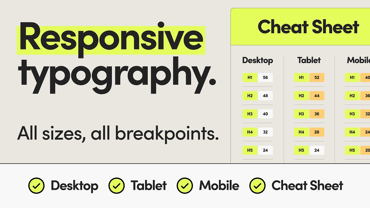
Typography plays a crucial role in web design as it directly affects the readability and user experience of a website. Responsive typography refers to the practice of adjusting font sizes, line spacing, and other text attributes to ensure optimal readability across different devices and screen sizes.
Responsive typography is all about adapting to the user’s needs. By adjusting the size, spacing, and layout of text based on the device being used, you can create a more enjoyable reading experience for your visitors.
Why is Responsive Typography Important?
Responsive typography is essential for creating a seamless user experience on your website. With the growing number of devices, screen sizes, and resolutions, it’s crucial to ensure that your text is easy to read and aesthetically pleasing across all platforms.
Imagine visiting a website on your smartphone and struggling to read tiny, cramped text. Frustrating, right? Responsive typography ensures that your text looks good and is easy to read no matter how your visitors are accessing your website.
Principles of Responsive Typography
When it comes to mastering responsive typography, there are a few key principles to keep in mind. These principles will help you create text that is visually appealing, easy to read, and responsive on any device.
Scalable Fonts
One of the fundamental principles of responsive typography is using scalable fonts. Instead of specifying font sizes in fixed pixels, use relative units like percentages, ems, or rems. This allows your text to scale proportionally based on the user’s device and browser settings.
Using scalable fonts ensures that your text remains legible across different screen sizes and resolutions. It also makes your website more accessible for users with disabilities who may need to adjust the font size for readability.
Fluid Typography
Fluid typography is another essential concept in responsive design. With fluid typography, font sizes and line spacing are set using relative units that adapt to the viewport size. This allows your text to resize smoothly as the screen size changes, creating a harmonious and balanced layout.
By implementing fluid typography, you can maintain the hierarchy and readability of your text across various devices without sacrificing aesthetics. It also helps create a more consistent look and feel for your website, regardless of the user’s screen size.
Modular Scale
A modular scale is a set of harmonious proportions that can be applied to both typography and layout. By using a modular scale, you can establish a consistent rhythm and visual hierarchy in your text.
A modular scale helps create a sense of order and harmony in your typography, making your text more visually appealing and easier to read. It also allows you to maintain a balanced layout and spacing throughout your design, enhancing the overall user experience.
Contrast and Readability
Contrast and readability are crucial aspects of responsive typography. To ensure that your text is easy to read on any device, pay attention to the contrast between the text color and the background.
It’s essential to choose colors that provide enough contrast for readability, especially on smaller screens or in low-light conditions. You should also consider the line length and spacing to prevent eye strain and improve legibility.
Best Practices for Responsive Typography
Now that you’re familiar with the principles of responsive typography, let’s dive into some best practices to help you master this essential aspect of web design.
Use Media Queries
Media queries are a powerful tool for implementing responsive typography. By using media queries, you can define different styles for text based on the device’s screen size, resolution, or orientation.
For example, you can set specific font sizes, line heights, and spacing for small screens like smartphones and larger screens like desktops. This allows you to tailor the typography to each device, ensuring optimal readability and aesthetics.
Breakpoints
Breakpoints are specific points at which your design changes to accommodate different screen sizes. By defining breakpoints in your CSS, you can adjust the typography and layout of your website for various devices.
For example, you can set different font sizes, spacing, and line lengths at each breakpoint to ensure that your text looks good on both small and large screens. This helps create a smoother transition between different screen sizes and maintains the integrity of your design.
Use Web Fonts
Web fonts play a significant role in responsive typography. By using web fonts, you can choose from a wide range of typefaces and styles to enhance the visual appeal of your text.
When selecting web fonts, consider their legibility, readability, and compatibility across different devices and browsers. You should also pay attention to the file size and loading speed to ensure a smooth user experience.
Optimize Line Length
The length of your text lines, also known as line length, plays a crucial role in readability. For optimal readability, aim for 45-75 characters per line, including spaces.
Long lines of text can be tiring to read, while short lines can disrupt the flow of reading. By optimizing the line length, you can improve the readability and user experience of your website, especially on smaller screens.
White Space
White space, also known as negative space, is the empty space around your text that helps improve readability and aesthetics. By adding generous amounts of white space around your text, you can create a sense of balance and focus for your content.
White space also helps prevent clutter and enhances the overall user experience by making your text more scannable and visually appealing. Don’t be afraid to use white space to separate text elements and create a clean, modern design.
Accessibility
Accessibility is a crucial consideration in responsive typography. To ensure that your text is accessible to all users, including those with disabilities, you should follow best practices for typography, color contrast, and legibility.
Choose fonts that are easy to read and distinguish, use high-contrast colors for text and background, and provide options for users to adjust the font size and spacing. By prioritizing accessibility in your typography, you can create a more inclusive and user-friendly website for all visitors.
Tools for Mastering Responsive Typography
To help you master responsive typography, there are several tools and resources available that can streamline your workflow and enhance your design process.
Google Fonts
Google Fonts is a free library of web fonts that you can easily integrate into your website. With hundreds of fonts to choose from, Google Fonts offers a wide variety of typefaces, styles, and scripts to enhance your typography.
By using Google Fonts, you can improve the visual appeal and readability of your text while ensuring cross-browser compatibility and fast loading times. You can also experiment with different fonts and styles to find the perfect combination for your design.
Adobe Typekit
Adobe Typekit is a subscription-based service that provides access to a vast collection of high-quality web fonts. With Typekit, you can choose from a diverse selection of professionally designed fonts that are optimized for web use.
Typekit offers advanced typographic features, customizable font settings, and easy integration with Adobe Creative Cloud applications. By using Typekit, you can elevate your typography and create a unique visual identity for your website.
Font Squirrel
Font Squirrel is a popular resource for free, high-quality fonts that can be used for both web and print projects. With Font Squirrel, you can discover a wide range of fonts in various styles and formats, including web fonts, desktop fonts, and more.
Font Squirrel also offers a font identifier tool, font generator, and font pairing guide to help you find the perfect fonts for your design. By exploring Font Squirrel’s collection, you can find unique and expressive typefaces that enhance your responsive typography.
Typewolf
Typewolf is a typography inspiration website that showcases beautiful and well-designed typography from around the web. With Typewolf, you can discover new fonts, styles, and layouts that inspire your own design projects.
Typewolf also offers resources, articles, and guides on typography best practices, font pairings, and web design trends. By browsing Typewolf’s curated collection, you can stay up-to-date on the latest typography trends and elevate your design skills.
Conclusion
Mastering responsive typography is a crucial step in creating a visually appealing, readable, and user-friendly website. By implementing the principles, best practices, and tools discussed in this article, you can elevate your typography and enhance the overall user experience of your website.
Remember to focus on scalability, fluidity, contrast, and accessibility when designing your typography. Experiment with different fonts, sizes, and layouts to find the perfect combination that works for your design. By prioritizing responsive typography, you can create a seamless and enjoyable reading experience for your visitors on any device.
Thank you for reading, and we hope this article has provided you with valuable insights and inspiration for mastering responsive typography. Happy designing!

