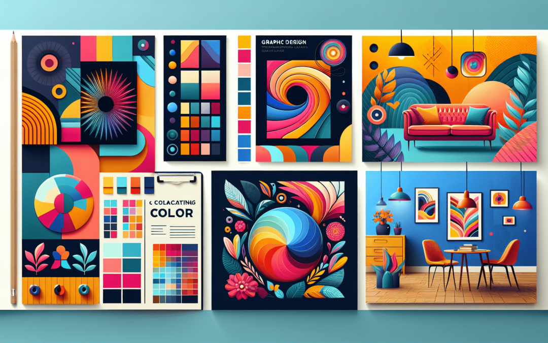
Get ready to unleash your creativity and make a splash with eye-catching designs! In this guide, we will explore the power of vibrant colors and how they can bring your creations to life. Whether you’re a seasoned designer or just starting out, this article will provide valuable insights and tips on incorporating bold and captivating colors into your work. Prepare to be inspired as we delve into the world of vibrant hues and discover how to make your designs truly pop. Let’s jump in!

Introduction to Vibrant Colors
Understanding the concept of vibrant colors
Vibrant colors are those that are vivid, bold, and intense, making them visually striking and captivating. Unlike muted or pastel shades, vibrant colors command attention and leave a lasting impression. They are often associated with energy, youthfulness, and creativity. Understanding how to utilize vibrant colors effectively can greatly enhance the impact of your design projects.
Exploring the impact of vibrant colors in design
The use of vibrant colors in design has a powerful effect on the viewer. It can evoke emotions, convey messages, and attract attention. Vibrant colors can instantly grab the viewer’s eye and create a sense of excitement or energy. When used thoughtfully, they can help create a memorable and engaging user experience. Whether it’s in web and app interfaces, print design, photography, or illustrations, vibrant colors have the ability to make your designs stand out from the crowd.
Color Theory Basics
Primary, secondary, and tertiary colors
To understand vibrant colors, it’s essential to have a basic understanding of color theory. Colors can be classified into primary, secondary, and tertiary colors. Primary colors are the building blocks of all other colors and cannot be created by mixing other colors. Secondary colors are obtained by mixing two primary colors, while tertiary colors are the result of mixing a primary color with a secondary color. This knowledge of color relationships can help you create harmonious color palettes.
Understanding color temperature
Color temperature refers to how warm or cool a color appears. Warm colors, such as red, orange, and yellow, evoke a sense of energy, passion, and warmth. On the other hand, cool colors, like blue, green, and purple, convey calmness, tranquility, and sophistication. Understanding color temperature can help you create the desired mood and atmosphere in your designs and ensure that the vibrant colors used align with the overall message you want to convey.
Color harmony and complementary colors
Color harmony is achieved when colors blend together harmoniously and create a balanced and pleasing visual experience. Complementary colors are pairs of colors that sit directly opposite each other on the color wheel. When used together, they create a vibrant and eye-catching contrast. Understanding how complementary colors work can help you create dynamic and visually appealing designs by using vibrant colors that work harmoniously with one another.
Choosing the Right Color Palette
Consider the purpose and target audience
When choosing a vibrant color palette, it’s important to consider the purpose of your design and the target audience. Different colors evoke different emotions and have different cultural associations. For example, bold and vibrant colors may be appropriate for a youthful and energetic brand, while more subdued and sophisticated colors may be better suited for a luxury brand. Understanding your target audience and the message you want to communicate will guide you in selecting the most effective vibrant color palette for your design.
Psychology of colors and emotions
Colors have the power to evoke emotions and elicit specific responses from viewers. Understanding the psychology of colors can help you create designs that resonate with your audience. For example, red is often associated with passion and excitement, yellow with happiness and positivity, and blue with trust and tranquility. By leveraging the psychological impact of colors, you can effectively communicate your desired message and create a memorable visual experience.
Using color psychology in design
Incorporating color psychology in design involves carefully choosing colors that align with the desired emotional response or message you want to convey. For example, if you want to create a sense of energy and urgency, you may opt for vibrant reds or oranges. Alternatively, if you want to evoke a calm and peaceful feeling, blues and greens can be used. By strategically using vibrant colors that align with the psychology of colors, you can create designs that resonate with viewers on a deeper level.
Creating Contrast and Balance
Understanding the importance of contrast
Contrast is a powerful tool in design as it helps create visual interest and impact. By using vibrant colors with contrasting tones, you can make certain elements stand out and draw attention to specific areas of your design. Without contrast, designs can appear flat and lack depth. Vibrant colors, when used in contrast with each other or with neutral colors, can create a dynamic and visually captivating composition.
Using complementary colors for contrast
One effective way to create contrast with vibrant colors is by using complementary colors. Complementary colors are located opposite each other on the color wheel. When used together, they create a vibrant and striking contrast. For example, pairing vibrant yellows with bold purples or vibrant blues with vibrant oranges can result in a visually captivating design. By utilizing complementary colors, you can achieve a high level of contrast that grabs attention and makes your design truly eye-catching.
Balancing vibrant colors with neutrals
While vibrant colors can be attention-grabbing, it’s important to balance them with more neutral tones to ensure a visually pleasing design. Neutrals, such as white, black, and various shades of gray, can help create a sense of balance and prevent the vibrant colors from overwhelming the overall composition. By incorporating neutrals strategically, you can allow the vibrant colors to shine while maintaining a harmonious and well-balanced design.

Applying Vibrant Colors in Typography
Exploring typography color schemes
Typography plays a crucial role in design, and choosing the right color scheme can greatly enhance the impact of your typography. When incorporating vibrant colors into typography, it’s important to consider readability and legibility. Vibrant colors can be visually striking, but they should not compromise the readability of the text. Experiment with different color schemes to find the perfect balance between vibrancy and readability.
Choosing readable color combinations
When using vibrant colors in typography, it’s essential to ensure that the text remains legible. High contrast between the text and the background is key to readability. Avoid using vibrant colors that have similar tones or values, as they can cause the text to blend into the background and become difficult to read. Opt for combinations that provide clear contrast, such as black text on a vibrant background or vice versa, to maintain readability while still utilizing vibrant colors.
Using color to convey hierarchy
Vibrant colors can also be used to convey hierarchy and guide the viewer’s attention. By assigning different colors to different levels of information, you can create a visual hierarchy that helps the viewer quickly and easily navigate through the content. For example, using a vibrant color for headings and a more subdued color for body text can visually separate the two and make it clear where the main points are. Using vibrant colors strategically in typography can enhance the overall visual impact of your design and improve the user experience.
Using Vibrant Colors in Photography and Illustrations
Enhancing photographs and illustrations with vibrant colors
Vibrant colors can breathe new life into photographs and illustrations, making them more engaging and visually appealing. By selectively enhancing certain elements with vibrant colors, you can draw attention to specific areas of the image and create a focal point. Whether it’s intensifying the colors of a sunset or adding pops of vibrant hues to a character illustration, the use of vibrant colors can elevate the visual impact of your photographs and illustrations.
Using different color techniques for different moods
Different colors can evoke different moods and create unique atmospheres in your photographs and illustrations. Vibrant colors can be used to create a sense of energy, excitement, and playfulness. Conversely, desaturated or muted colors can create a more somber or nostalgic mood. Experimenting with different color techniques, such as saturation, hue shifting, or color overlays, can help you convey the desired mood and complement the overall theme of your photographs and illustrations.
Creating visual impact with color composition
Color composition refers to how colors are arranged and combined within an image. By strategically placing vibrant colors throughout the composition, you can create visual interest and impact. The use of contrasting or complementary vibrant colors can draw the viewer’s eye and create a dynamic and engaging visual experience. Additionally, using color to guide the viewer’s gaze or create a balanced composition can enhance the overall aesthetics of your photographs and illustrations.
Designing with Vibrant Colors in Web and App Interfaces
Best practices for using vibrant colors in digital interfaces
When designing web and app interfaces with vibrant colors, it’s important to consider the overall user experience and usability. Vibrant colors can make your design visually appealing, but they should not hinder the usability of the interface. Ensure that the vibrant colors you choose do not clash with important elements such as buttons or text. Additionally, use color sparingly and strategically to guide the user’s attention and create a seamless and enjoyable experience.
Color accessibility and usability considerations
While vibrant colors can be visually striking, it’s crucial to consider color accessibility and usability. Ensure that there is sufficient contrast between the text and background colors to accommodate users with visual impairments. Run color contrast tests and make necessary adjustments to ensure readability for all users. Additionally, consider color-blindness and how your color choices may impact the user’s ability to distinguish certain elements. By being mindful of accessibility and usability, you can create vibrant and visually appealing web and app interfaces that cater to a wide range of users.
Creating visually appealing interfaces with vibrant color schemes
When using vibrant colors in web and app interfaces, it’s important to create a visually cohesive and harmonious design. Choose a color scheme that reflects the brand’s personality or the message you want to convey. Harmonious color schemes, such as monochromatic or analogous color schemes, can create a visually appealing and cohesive interface. Select vibrant colors that complement each other and create a sense of balance and unity. By careful color selection and thoughtful design choices, you can create interfaces that are both visually appealing and user-friendly.
Utilizing Vibrant Colors in Print Design
Using vibrant colors for attention-grabbing print materials
Print design offers a unique opportunity to utilize vibrant colors to grab attention and create impact. From business cards and brochures to posters and packaging, vibrant colors can help your print materials stand out from the competition. Experiment with vibrant color combinations that align with the personality of the brand or the message you want to convey. Be bold and bold with your color choices to create visually striking print designs that capture the viewer’s attention.
Choosing the right color profiles for printing
When designing with vibrant colors for print, it’s important to consider the color profiles and color modes used. RGB color profiles are used for web and digital design, while CMYK color profiles are used for print design. Be mindful of color shifts that can occur when converting from RGB to CMYK, as vibrant colors may appear slightly different in print. Additionally, ensure that your printer is capable of reproducing vibrant colors accurately. Consulting with a professional print service can help ensure that your vibrant color designs come to life as intended.
Combining vibrant colors with textures and finishes
To further enhance the impact of vibrant colors in print design, consider combining them with textures and finishes. Texture can add depth and visual interest to the design, while finishes such as glossy or metallic coatings can make the colors appear even more vibrant. Experiment with different combinations to achieve the desired effect. Using vibrantly colored textures or incorporating finishes can take your print design to the next level and create a memorable and visually engaging experience for the viewer.
Exploring Different Design Styles with Vibrant Colors
Minimalist design with vibrant colors
Minimalist design embraces simplicity, clean lines, and ample white space. Incorporating vibrant colors into minimalist designs can create a striking contrast that instantly captures attention. Use vibrant colors selectively to highlight key elements or to create focal points within the design. By combining the simplicity of minimalist design with the boldness of vibrant colors, you can create visually captivating and modern designs.
Retro and vintage-inspired designs with vibrant colors
Retro and vintage-inspired designs often evoke a sense of nostalgia and playfulness. By incorporating vibrant colors reminiscent of past decades, you can enhance the retro vibe and create designs that stand out. Experiment with retro color palettes, such as bold oranges, vibrant greens, and saturated yellows, to capture the essence of a bygone era. Adding vibrant colors to retro designs can breathe new life into them and create a sense of excitement and energy.
Abstract and artistic designs with vibrant colors
Abstract and artistic designs allow for more creative freedom and experimentation. Vibrant colors can be used to express emotion, convey abstract concepts, or create visually stunning compositions. In abstract designs, vibrant colors can be layered, blended, and juxtaposed to create intriguing visual experiences. By embracing vibrant colors in abstract and artistic designs, you can push the boundaries of creativity and create designs that are visually captivating and thought-provoking.
Avoiding Common Mistakes with Vibrant Colors
Overusing or clashing vibrant colors
While vibrant colors can be attention-grabbing and impactful, it’s important to use them judiciously. Overusing vibrant colors can create overwhelming and chaotic designs that are visually overwhelming. Instead, use vibrant colors selectively to highlight key elements or create focal points. Additionally, be mindful of color combinations that clash or create visual discomfort. Strive for a harmonious and visually pleasing balance between vibrant colors and more subdued tones or neutrals.
Ignoring color theory and psychology
Color theory and psychology play a crucial role in creating impactful designs with vibrant colors. Ignoring these principles can result in designs that lack cohesion or fail to effectively communicate the desired message. Take the time to understand the basics of color theory and the psychological impact of colors. Use this knowledge to inform your color choices and create designs that resonate with viewers on a deeper level.
Neglecting accessibility and readability
Accessibility and readability should always be a priority when designing with vibrant colors. Vibrant colors can often pose challenges to users with visual impairments if not used with care. Ensure that there is sufficient contrast between text and background colors to ensure readability for all users. Test your designs for color contrast and make necessary adjustments to ensure accessibility. By considering accessibility and readability, you can create designs that are both visually appealing and inclusive.
In conclusion, vibrant colors have the power to enhance the impact of your designs and create visually captivating experiences. By understanding color theory, selecting the right color palettes, creating contrast and balance, and incorporating vibrant colors strategically in typography, photography, illustrations, web and app interfaces, and print design, you can create eye-catching designs that leave a lasting impression. Avoid common mistakes by using vibrant colors thoughtfully, considering color theory and psychology, and ensuring accessibility and readability. Embrace vibrant colors and unleash your creativity to create designs that truly stand out.
Recent Comments